Reports
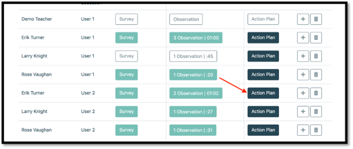
1. In order to view and edit a report, select the “Action Plan” button under the “observations” tab.
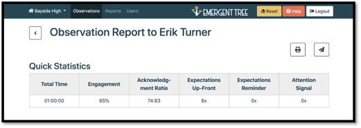
2. The quick Statistics table will allow to see a brief summary of the observation.
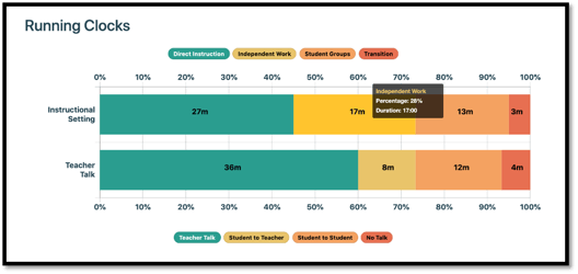
3. The running clocks bar graph allows you to see the amount of time based on the setting and talk time selected during the observation.
NOTE: with your mouse, hover over a section/color on the bar graph to see more details (i.e. duration of the specific activity).
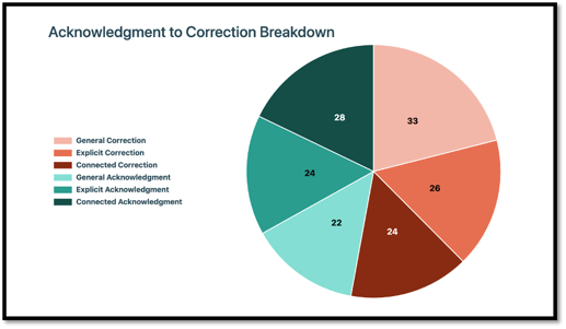
4. The acknowledgment to correction breakdown pie graph shows a detailed view of acknowledgments to corrections within the observation.
5. The direct observation bar graph allows you to see data based on engagement time and the type of instructional activity.
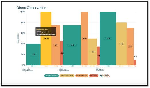
6. The numbers at the bottom of each bar tells you the amount time spent on each activity.
NOTE: this graph allows you to have data driven recommendations and apply action items as needed to any areas of focus.
8. The goal is to be above the 80% line for each activity. This allows you to have another data point to apply coaching strategies as needed.
9. If you see any diagonal lines on your graph, this means no engagement data was taken during that instructional activity.
10. Acknowledgement to correction ratio: from the research, we know the goal is a 3:1 ratio or better.
11. If you hover your mouse over a certain bar on the graph, you’ll see a window pop-up with even more detailed data.
-
- A more specific percentage of engagement
- The ratio of acknowledgement to correct
- The teacher prompts that were present during the instructional activity and the number of times noted within the activity
NOTE: within the hover over box, you’ll see the exact number of acknowledgements to corrections vs. on the bar, the lowest common denominator is given.
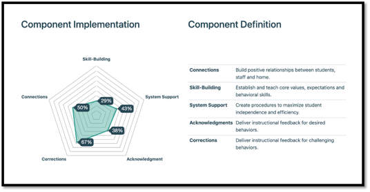
12. The radar graph allows you to see the data with more specificity. This graph provides a percentage for each component to see at what level of fidelity the teacher is implementing each element.
NOTE: the goal would be to have the entire hexagon to be shaded almost entirely light green to reach fidelity.
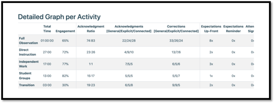
13. The detailed graph per activity allows you to see data with a broad view of instructional activities included in the observation. The data includes the number and percentage of prompts within the activities.
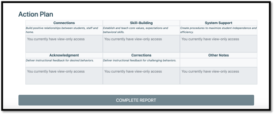
14. The Action Plan carries over from any quality practices and areas of focus you noted in the survey.
15. However, you can edit these in the report before selecting the “complete report” button.
16. Suggested actions are goals for the teacher (preferably quantifiable) that you can begin to measure and track.
17. If you’ve completed the report and had a coaching conversation with the teacher, select the “complete report” button at the bottom of the report.

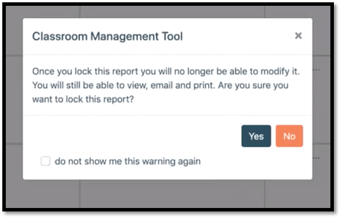
NOTE: once you select “yes” to complete the report, the report will then be locked, and you’ll be unable to edit it in the future.
